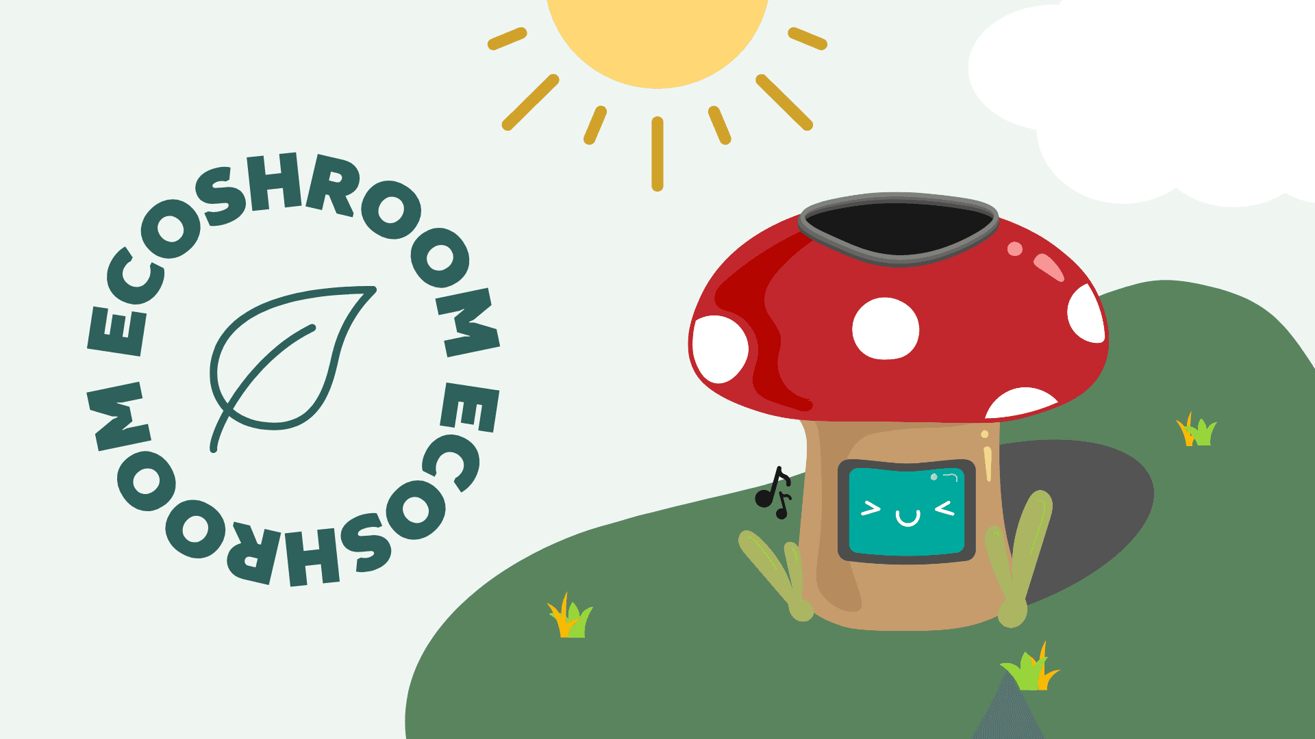
Ecoshrooms

📝 Context
For a class project on Lifestyle, my team tackled 'post-party blues,' a deeply human experience. I led exploratory research and guided our iterative design process, resulting in the highest grade in our cohort.
🤝 Role
Product & Service Designer
⌛️ Timeline
Feb – Jun 2023
👯♀️ Team
Vivian Truong + 1 Team Member
🎭 My Role
I worked as both a product and service designer across the full end-to-end process, from scoping the problem and leading research, to ideating, prototyping, testing, and refining our final concept.
I contributed heavily to:
User interviews and contextual observation
Synthesising insights into a clear problem statement
Early concept sketching and storytelling
Designing the digital interface
Illustrating the final visual identity
Throughout, I focused on making the design feel playful, intuitive, and emotionally resonant, even if it was “just a bin.”
📌 The Problem
Rubbish sucks.
We don't like the smell, the look, the touch.
Now, urban parks offer numerous benefits to visitors and residents like free space, free use of amenities and community events, yet we often see large areas of these parks with little to no visitors.
Why is this the case?
Well when we observe these open green spaces we also come across outdated amenities and facilities and can confirm that:


Kicking off ideation with a team sketching session
How does this affect our cities?

(UN-Habitat, 2020)
Do any solutions exist?
Through competitors analysis, we found these urban parks primarily had large areas of green space being underutilised with a lack of amenities and facilities contributing to this problem.

I never expected to care so much about bins. But this made me realise how small, overlooked details shape how people feel in public space. There’s emotion in infrastructure if you pay attention!
🧠The Solution

EcoShrooms use renewable energy and friendly design to make sustainability more engaging.
⏳ The Process (Roughly)
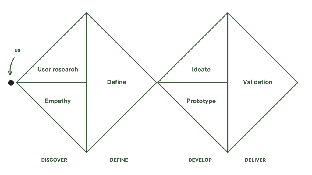
We followed a double diamond process, starting wide, then narrowing toward a tested solution.
We followed a double diamond process to explore the problem space, then narrow in on solutions. From research to prototyping, we stayed grounded in user needs while exploring playful, sustainable ideas for public parks.
💭 Discover
Primary Research
Based off of our market research, we decided to investigate these research objectives, focusing on human-concious actions in relation to sustainability.
🤔
How often do people consciously notice their everyday behaviours and actions?
We used four various methods of research all for different purposes as a way of obtaining insights to the problem we encountered.
In total we received:
Surveys

📝 110 User Survey Responses
(Which gave us a large amount of quantitative and qualitative data from our target users)
Interviews

🗣️ 5 User Interviews
(Gave us with context into unique and meaningful experiences so that we are able to better understand them)
Online Ethnography

Contextual Observation

🌳 4 Park Observations
(To understand first hand what users experience and encounter at urban parks from contextual observation over at Sydney Park and Central Park)
I learned how to slow down and observe. The numbers gave us patterns, but it was the quiet, in-between moments during interviews and observations that revealed what really mattered to people.
📝 Define
From the user research we conducted, we organised all our data through affinity mapping by taking quotes, observations and findings through an affinity map trying to identify any trends.

We affinity-mapped our findings to uncover patterns and priorities.
Through this we discovered three main themes and six important insights:
🏞️
Utilisation of sustainable park facilities & amenities
Urban parks need more engaging and sustainable facilities to bring people in… not push them away. Right now, outdated amenities are causing people to avoid green spaces altogether.
♿
Accessibility
Most parks still ignore physical accessibility. By designing inclusive and usable facilities, we can make parks feel truly open, not just in space but in spirit.
🦗
Environment
Poor lighting and neglected spaces make parks feel unsafe. When parks invite human interaction and activity, they become places where people want to be, not just pass through.
At first, it all felt messy. But sitting in that ambiguity taught me how clarity is something you build, not find. It’s in the sorting, listening, and making sense of the noise.
💡 The Problem Statement
How might we utilise sustainable energy to facilitate human interaction and play with amenities in urban parks, using green space as the playing field?
Empathy Mapping
Coming from these insights, we wanted to use these findings and sort them into an empathy map.
Every user is complex so grouping our data ensured that we could spot inconsistencies between their thoughts versus actions.
Mapping user perspectives helped us align our design with real emotions and needs.
Meet Caroline
And after seeing the juxtaposition between quadrants in our empathy map, we wanted to visualise the entire end-to-end experience in an urban park.
So, Meet Caroline. She is an amalgamation of every bit of research we uncovered and she wants to go to the park.

Caroline’s journey reveals gaps in park seating, lighting, and waste access.
📦 Develop
We kicked things off with a rapid ideation sprint, sketching out early concepts through storyboards. From cherry blossom rest stations to frog-shaped solar bins, no idea was too weird. Just playful, purposeful, and grounded in user insights.
Each of us brought 3 concepts to the table. My teammate explored interactive bins shaped like mushrooms that glowed and spoke. I leaned into safety-focused features like soft lighting and nighttime visibility.
Both of us noticed the same issue: bins in parks just didn’t stand out, or worse, didn’t exist. So we asked: what if the bin itself sparked joy?
Final Concept Selection
To choose our final direction, we scored our top ideas using a decision matrix, rating each concept on things like play, accessibility, innovation, and sustainability.

Mushroom bins outperform art pieces in play, aesthetics, and sustainability.
The Sustainable Mushroom Bin came out on top. It was playful, functional, and designed to spark interaction without sacrificing feasibility.
Why Mushrooms?
| The question you’re probably wondering is, why mushrooms?
When it came to deciding what type of product we wanted to create, we wanted to ensure it was something that not only met our users needs, but also drew attention and sparked curiosity within users. The decision came down to three different purposes.
🪞
Aesthetics
We found that mushrooms have a unique and recognisable shape that is visually appealing. We thought it created a whimsical and playful look that is popular in certain design styles.
🌳
Connection to Nature
Products shaped like mushrooms also can evoke a sense of outdoors, with people feeling a connection to the natural world when viewing it.
🎮
References to Pop Culture
Growing up, many of us who played or play video games have surely encountered a mushroom element in a game for different purposes.
Concept Iteration
Our product comprised three primary sections, starting from sketching the low-fidelity concepts to crafting our physical prototype. Throughout this journey, our process heavily emphasised iterative testing.

Our design evolved through low-fi, high-fi, and physical prototyping stages.
Low/Mid-Fidelity Prototyping
We had two main components of our concept iterations. Focusing on balancing the physical prototype with our digital interface.
Physical Prototype

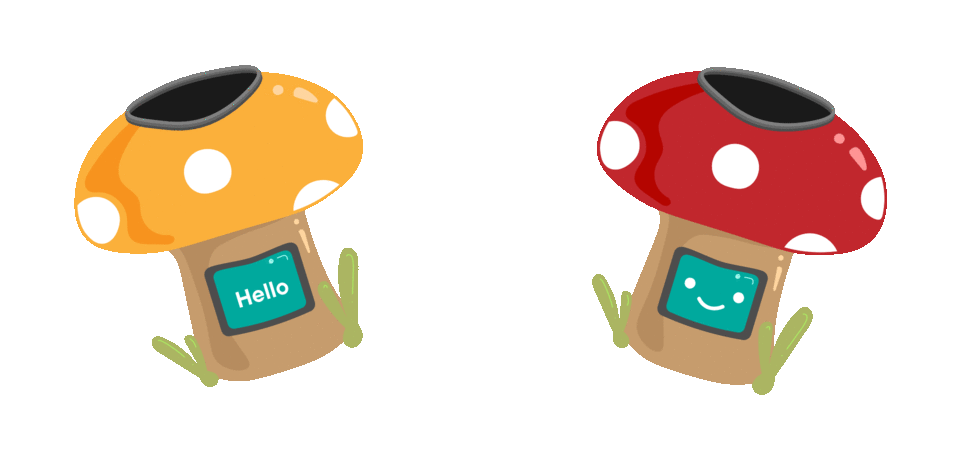
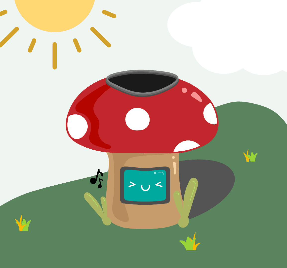
EcoShrooms are playful, mushroom-shaped bins with an interactive screen built into the stem. We focused on crafting key features that felt both intentional and inviting.
Digital Interface

Since these bins would stand out in public space, we made every part of the screen count, combining helpful info, friendly faces, and simple interactions to make waste feel... well, less rubbish.
We had two main components of our concept iterations. Focusing on balancing the physical prototype with our digital interface.
💻
Friendly interfaces
We kept the screen simple: one side shows a friendly face or message, the other a clear bin symbol. No clutter, just enough to guide and delight.

From sketch to screen, visualising the bin’s digital interface.
🗑️
Rubbish Holes
The bin opening sits right at the top. It’s the most intuitive spot, and avoids the mess (and weird angles) of side holes.

Sketch of rubbish openings alongside final mushroom cap render.

Collaborative board mapping current features and future improvements.
High-Fidelity Prototyping
When iterating our Hi-Fidelity prototype, we consulted a mood board to guide our visual design decisions and craft a welcoming experience for visitors to the park.
To emphasise the fun and refreshing intent of the design for users, I illustrated these mushrooms to convey a design aesthetic that aligns with this goal, ensuring it complements rather than impedes functionality.


Final designs include sound, screens, lights, and colour-coded recycling.
Physical Prototype
Now that we had EcoShrooms, it was time to construct our prototype for user testing.
After much much deliberation, we decided to use paper mache to construct the mushroom whilst the stern underneath was a painted flower pot.

Exploring sustainable materials made from paper, flour, and water.
Using the university labs, constructed the physical model and carved out a hole for the rubbish chute.

Early physical prototyping using glue, wood panels, and cut acrylic.
Later on, we painted the ecoshroom bin according to the corresponding symbol for each type of waste. For instance, red represents general waste.

Painting and lighting the mushroom bin cap to achieve a glowing effect.
We used our phone lights to demonstrate the spatial aspect of EcoShrooms and paper slide outs to visualise our screen.
This reminded me how important it is to let go of perfection early. Giving ideas space to be strange or playful led us somewhere unexpected, but exactly right!
🎁 Deliver
User Testing
We tested two different aspects of EcoShrooms, space and sound. Getting users to think aloud whilst doing tasks, we got them to throw rubbish into the bins and listen to various sounds, rating them based on how affirmative they sounded.
Afterwards, we asked them some questions like:
| “What was the first thing you noticed about our product?”
| “Is there anything you're confused about?”
In total we had:


Usability testing setup with consent forms, notes, and user tasks.
Our main feedback was:
✨
Visually Appealing
People really enjoyed how cute and eye-catching the EcoShroom was and pointed out that the glow of the mushroom head was what first caught their eye as well as just the fact that it is a mushroom.
🎭
Empathy
They really identified with the faces and text shown on the EcoShroom screens.
🗑️
Is it a bin?
People did not think that the EcoShroom was a bin. In fact, most thought they were art installations or lamps.
♻️
Waste Sorting
People seemed to have trouble distinguishing what bin their rubbish went into as we seemed to have assumed that the colours of red and yellow were internationally recognised as general waste and recycling. For example, when prompting users to throw a Yakult bottle, which is meant to go into recycling, 55% of people threw the yakult bottle into general waste.
📣
Sound Preferences
Sound was very preferential, no two people had a similar answer and we ended up with a skewed data range.
With these insights in mind, we continued to iterate to build our final product.
This was a lesson in letting go of assumptions. Seeing people misinterpret our design was frustrating at first, but also a necessary shift. The work isn’t done until it speaks clearly!
🎨 Brand and Visual Identity

Moodboarding
Clean. Fresh. Cute.
Those were the keywords we focused on when moodboarding.

Style Guide
I illustrated these final designs to bring our product to life. We hoped to capture a friendly and accessible vibe to make ecoshroom bins attractive to park-goers.
🧠 The Solution
It takes the form of a friendly mushroom, in yellow and red colour for different purposes of waste disposal.

Powered by the sun
EcoShroom harnesses energy from the sun to generate the digital components of our product and the light it produces at night

Interactive Screen
Digital features include an interactive screen that generates emoticons and text every time someone throws their trash away
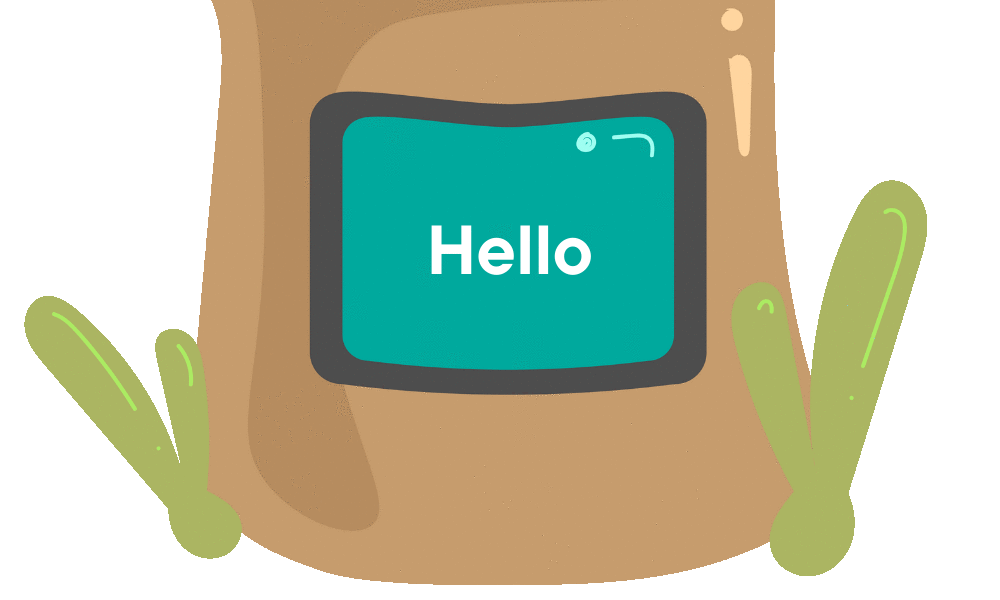
Affirmative Screens
When the bin isn’t being interacted with and is sitting idle, it displays ‘Hello’ in different languages as a way of encouraging interaction with park users.

All Users Considered
Ecoshrooms will enclose bins and can be opened using a key feature on the side of the bin for cleaners to removing the waste easily out of the bin

Final prototype labelled with features like colour coding, screen, and sounds.

The mushroom bin lit up at night, drawing attention with its glow.

Bin prototype in a public setting, blending into the park environment.
🔭 Where next?
If we were to continue Ecoshrooms, these are the steps we'd take to release it to the public. We planned out a comprehensive marketing strategy to generate awareness and attract users, followed by rigorous testing and refinement to ensure the product meets user expectations.

Roadmap detailing team responsibilities across design, dev, and marketing.
📌 Lessons Learnt
Some important learnings I made along the way

Being happy with our results!
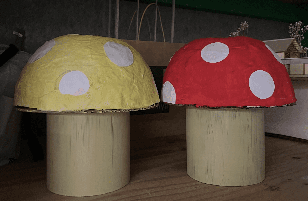
Red and yellow mushroom bin models.
♿ Consider Greater Accessibility
Our current conclusions are that we need to make EchShrooms more accessible, this can be done by adding symbols, images and text indicating which rubbish should go where.
Furthermore, we’ll need to explore how to utilise sound in a way which suits everyone’s needs, possibly by rotating the sounds each usage or finding more affirmative-related sounds.
🔁 Modify the process to fit the need
Since this project was for a university unit, we had to swiftly research, prototype, and refine a design solution within a tight timeframe.
Through this experience, I gained a deeper insight into prioritisation and utilising UX tools to grasp the needs of the audience and enhance the design solution.
🍄 You have reached the end of the case study :)
Thanks for being a fungi and reading my ramblings.