Memento
📝 Context
For a class project on Lifestyle, my team tackled 'post-party blues,' a deeply human experience. I led exploratory research and guided our iterative design process, resulting in the highest grade in our cohort.
🤝 Role
Product Designer & Product Manager
⌛️ Timeline
Jul 2023 - Nov 2023
👯♀️ Team
Vivian Truong + 2 Team Members
💼 My Role
I wore many hats in this project, shaping the strategy, research, and design from start to finish.
👩💻 Product Designer & Product Manager
🔍 Research
Conducted interviews, surveys, and online ethnography to uncover key emotional pain points.
✍️ Synthesis
Co-created personas, journey maps, and defined the problem space.
🎨 Design
Sketched early concepts, prototyped interactions, and co-built the visual identity and design system.
🧪 Testing
Ran usability testing (think-alouds, SUS surveys), analysed results, and iterated the product.
📋 Project Management
Kept timelines on track, ensured alignment, and drove key decisions throughout.
🧐 The Problem
Events. Parties. Concerts. Whether or not you’ve been to one in a while. We will always have to wonder about: after.
In our lifetimes, we spend most of it wondering about the ‘what-ifs’

Vivian Truong
95%
of young adults today are attending events, having fun and making memories.
(Friese & Grube, 2014)
64%
are leaving them feeling stressed, anxious and fatigued.
(Parker, 2018)
Even the world’s biggest extroverts admit that they get post-party blues:

“I’m not even going to lie, you guys be making me feel FOMO like why didn’t I go to the Grammys like post-party blues for real”
- Kim Kardashian
(Kardashian, 2023)
What if we altered what after looked like?
Today, audiences are creating hundreds of thousands of group chats and event pages via DMs on countless social media platforms just to convey the simple information of event details.
Instagram and Facebook have varying modes of event creation platforms, often used by university societies and sometimes, young adults and teenagers, but no-one has thought about how these outings are affecting people post-event.
🧠 The Solution
Memento: Why just reminisce about events when you can relive them, prolong those memories and anticipate future ones?

From invite to afterglow, Memento helps you personalise, reconnect and relive every moment.
⌛️ The Process (Roughly)
We followed the Double Diamond model to guide our thinking, from broad exploration to focused delivery. This helped us move from problem discovery to solution testing in a structured but flexible way.

The Double Diamond model guided our process from open exploration to focused delivery.
💭 Discovery
Primary Research
After undergoing secondary research, we conduced the triangulation method of surveys, semi-structured interviews and online ethnography surrounding the following research questions:
In total we conducted:
Surveys

📝 90 Responses
Interviews

🗣️ 14 Participants
Online Ethnography

🌐 30+ Forums
And… What did this tell us?
What are the primary challenges you face in maintaining consistent, meaningful, and in-person connections with your adult friends?
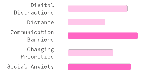
We discovered that digital distractions, communication barriers and social anxiety were the most prevalent challenges, sparking further inquiries into the reasons behind people experiencing these particular feelings.
| Why are people leaving parties feeling so empty?
Who experienced post-party feelings?
Introverts vs Extroverts

The occurrence of post-event feelings appears to be evenly distributed between introverts and extroverts, suggesting that the post-event experience is not significantly skewed towards a specific personality type.

Direct quotes showing how users experience emotional lows after events.
I learned how to hold space for quiet, complicated feelings. This part of the process showed me how common emotional burnout is, even among extroverts, and how design can offer comfort as well as solutions.
📝 Define
We sorted the notes from the online ethnography + survey + interviews and categorised them to find commonalities.

Clusters of sticky notes from our FigJam board, used to group and analyse insights across all three research methods.
After synthesising and analysing our key findings, we identified 5 key insights:
Societal Pressure
Experiencing pressure to swiftly transition, maintain productivity amidst post-event emotions, and feeling compelled to update others despite facing negativity.
Returning to Routine
Greater anticipation of an event correlates with reduced post-event sadness and suggests a prolonged recovery period, while young individuals may experience confusion and diminished sense of purpose upon returning to normalcy after adrenaline-filled activities (Poole et al., 2020).
Individual Recovery
Balancing productive and relaxing activities, including moments of isolation for social battery recharge, helps in managing post-event emotions and regaining routine momentum.
Social Reconnection
Sharing personal narratives to enhance understanding, processing emotions through collective experiences, and nurturing relationships via ongoing communication.
Distilling pain points into five insights taught me how to translate messiness into meaning. It reminded me that good design starts with empathy, and that emotional nuance deserves structure too.
💡 The Problem Statement
After exciting events, young people often feel a mix of emotions like nostalgia, emptiness, and social fatigue post-event. These feelings can get worse when they try to ignore their emotions or rush back to being productive.
And whilst there are plenty of ways to bounce back after events, it's still tough for many to unwind and hold onto those special memories.
Who are we designing for?
We categorised our interviewees among different demographic and event-going factors using a data sheet. These factors range from whether they are female or male to whether they are productive or restful during the post-event phases.
We identified interviewees with similar traits, resulting in two extroverted and one introverted personas along the introvertedness spectrum. They were categorised based on the events they mainly discussed: travel, concerts, or parties.

Persona data sheet comparing participant traits and behaviours during the post-event phase.
Meet our Users

Mary
"Reconnecting with friends after the event is probably really important because I like to catch up and see what everyone's experience was.”

Chris
"I try to enjoy the moment because I am aware that it won't last. Life's too short to dwell on what might be passing by."

Tanya
"I just wish I could have talked to more people for longer. Because I talk to people on a surface level, just small talk.”
Storyboarding
Articulating the challenges encountered during the emotional and social integration process of an individual grappling with anxiety at social gatherings.


We've crafted a User Journey map featuring Mary, illustrating the dynamic evolution of experiences from initial reluctance and social withdrawal to gradual adaptation and heightened anxiety throughout all stages of an event.

Mary’s journey through a party shows emotional highs, lows and reflection after using Memento.
Crafting personas helped humanise our research. I began to see design not just as a tool for solving problems but as a medium for honouring people’s lived experiences.
📦 Develop
We explored a wide range of ideas using three ideation techniques. After multiple rounds of concepting and critique, we condensed our creativity into three rough concepts.


So… How did we choose our direction?
We built a decision matrix to evaluate each idea based on:
👍
Likeability
💡
Interest factor
📈
Market Demand
Memento earned high scores, not just for its flexibility, but because it allowed us to explore emotional depth without enforcing a rigid structure.
| “It felt open-ended, but personal. The story could belong to anyone.”
That said, ideas from other concepts (Stash and Memory) were too strong to ignore. We brought the best of each into Memento’s final direction.
Prototyping
Our team had undertaken 4 rounds of tests throughout prototyping from Mid fidelity to High Fidelity

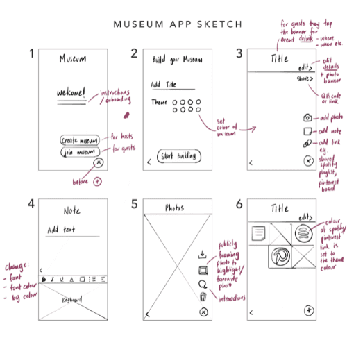
Sketching the Foundation
Before diving into wireframes, we mapped out the structure and flow of Memento through low-fidelity sketches. This helped us:
💡
Identify essential screens early on and map them out
📊
Focus on information hierarchy and user flow
👉
Spot gaps in logic before committing to a direction

Early wireframe sketches with layout notes and design ideas.
These sketches weren’t about perfection; they were about asking, “What does emotional reflection look like on a screen?”
Instead of showing individual screens out of context, we laid out the full app flow, annotated with insights, interaction notes, and key moments we wanted to test later.
Low-Fidelity Prototyping
Upon finalising sketches, low fidelity prototyping was utilised for the purpose of laying out broad concepts early within the design process. Out of multiple iterations, some significant iterations included:
🧠 Considering the Thumb Zone
Efficiency & Usability
We noticed that users interact most with the bottom-right area of the screen, where their thumb naturally rests (Nielsen Norman Group, 2016). So we placed Memento’s CTAs and emoji selectors in this “thumb zone” to make the interface feel effortless and intuitive.
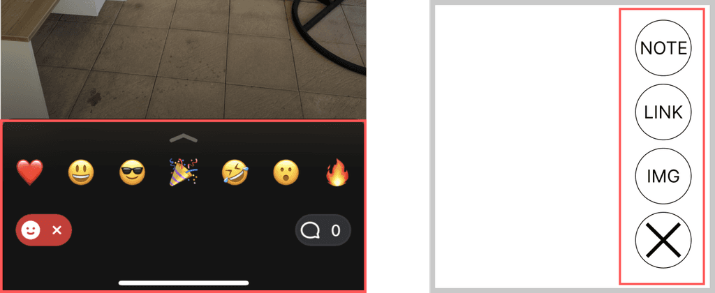
Interface ideas for emoji reactions and memo input tools.
🧩 Widget-Based Interaction
Consistency & Memorability
Instead of showing full pages for each input, we designed “memo widgets”, modular elements users could layer, rearrange, or remove. Rounded corners and a soft visual hierarchy were used to reduce cognitive load (Tey, 2022), especially during vulnerable post-party moments.

Sketch and wireframe of a note-taking widget for user entries.
This phase pushed me to embrace imperfection and ambiguity. Sketching for emotion rather than clarity taught me to trust intuition and to design for the in-between moments, not just the main ones.
Mid-Fidelity Prototyping
After validating our structure in low-fidelity, we moved into mid-fidelity to refine our interaction flow and content logic. This stage was all about clarity, usability, and preparing for high-fidelity implementation.
Out of multiple iterations, two key improvements stood out:
🎛 Delegating Customisation Options
Clarity & Cognitive Load Reduction
We split event customisation into two clear categories:
✏️
Detail-oriented (e.g. date, location, description)
🎨
Appearance-oriented (e.g. theme, layout, color)

UI flow for editing event details and visual appearance.
This separation created a clearer UI and allowed users to focus on one type of decision at a time. It also laid the foundation for improved input methods and a stronger information hierarchy.
📅 Adjusting Input Flexibility
Efficiency & Accessibility
In Lo-Fi, users could only select a date from the calendar. In Mid-Fi, we added a second option: manual input via keyboard. This gave users greater flexibility, especially for fast input or editing on the go.
We also included end date visibility, helping users better understand the duration of events.
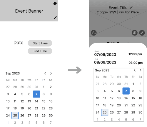
Calendar interface for selecting event start and end times.
What We Learned from Testing
To evaluate our mid-fidelity prototype, we tested static frames with participants using three complementary methods. These sessions helped us understand usability, emotional clarity, and interaction flow.

Cognitive Walkthroughs

🗣️ 10 Participants
System Usabiity Scale

🎙️ 15 Responses
After transcribing the sessions, we used affinity mapping to group key observations. From these clusters, we created an Insights Table that captured recurring patterns and design implications.
Affinity Mapping

Analysing test feedback using UX heuristics.
Insights Table

Detailed evaluation table mapping user feedback and design impact.
Here, I learned how small interface decisions could have a big emotional impact. Segmenting information and simplifying choices helped us reduce user overwhelm and meet them with more care.
High-Fidelity Prototyping
After synthesising feedback from multiple testing rounds, we prioritised iterations based on their impact on usability, alignment with our problem statement, and frequency of friction across users.
We then integrated these insights into a refined high-fidelity prototype, following a consistent design system that balanced emotional sensitivity with clarity. Below are ta few examples of our iterations:
1. Clearer Visual Hierarchy for CTAs
Memorability
To address confusion around tappable vs. static elements, we adjusted button styling to create clearer visual contrast. This resolved mis-taps and helped guide users more intuitively through the interface.
→ Improved: scan flow, CTA consistency, and button memorability

Updated button styling for clarity and hierarchy.
2. Simplified Font Selection
Effectiveness
We revamped the typeface selector to reduce friction and cognitive load. Users could now pick from a curated list of font previews or type in their choice, making the interface more accessible for both beginners and advanced users.
→ Improved: accessibility, flexibility, and customisation experience

Replaced text input with visual font selection tiles.
3. Smarter Emoji Input
Efficiency
Users expressed frustration with having to manually dismiss the keyboard after emoji input. We added an automatic keyboard-close action after emoji selection to streamline the process.
→ Improved: input efficiency and reduced cognitive overhead

Placed Done button in context of emoji selection flow.
4. Selection Feedback for Media
Memorability
Users often lost track of their selection when browsing framed memos. We added subtle dot indicators and improved border treatment to help users understand their current position and confirm selection feedback.
→ Improved: memorability, feedback, and user confidence

Improved visual styling of selected media thumbnails.
Testing taught me that how people feel matters just as much as what they do. Watching users hesitate or smile reminded me that emotion is a key usability signal.
A Brand Transformation
| “This looks like it was made for someone’s mum.”

Moodboards showing visual references and party aesthetics.
Originally, our colour palette leaned into orange and blue, chosen for their associations with optimism and warmth, especially for users in a reflective, post-event phase. But in practice, it conveyed what one designer described as:
“An outdated grandma feel.”
So, we pivoted. We moved to a black-and-white base with neon blue accents, evoking a nostalgic, photo-journal vibe.
We paired it with lowercase headings, emojis, and soft grunge textures to make it feel more casual than corporate.
The final aesthetic channels early 2000s memory-keeping, reimagined for a Gen Z audience.
Reworking the brand identity showed me that visual design is not just about style. It shapes how safe and seen users feel. The pivot reminded me to design with people, not just for them.
Building Our Interactions
Once our visuals and structure were in place, we brought our mockups to life using interactive prototypes in Figma.
We began with expert reviews to identify usability risks, then ran unmoderated think-aloud tests with target users to gather behavioural insights at scale.
🧪 Our research methods:
Expert Testing

Heuristic evaluation notes grouped by section.
📝 2 Heuristic Evaluations, enabling experts to engage in discussions and reach consensus on usability issues.
User Testing

Demographics of usability test participants.
🗣️ 15 unmoderated think-aloud tests using Loop11 software, enabling us to capture insights from our target users through a comprehensive dataset.
This helped us identify subtle UX issues, including one we hadn’t expected:
📱 Are users easily learning what “label” means?
One of our most impactful changes came from improving how users add links within Memento.
💡 The Problem
Users were confused by the label toggle and unsure whether link titles were required. The interface wasn’t accessible, and the flow lacked clarity.

Improved input fields for clearer link labelling.
So what did we do?
♼
Replaced the toggle with simple hint text: “(Optional)”
→ Clearer, less cognitive effort
🧩
Reordered the fields to follow expected patterns
→ Title first, then link. Easier to scan.
📚
Renamed “label” to “display label”
→ More descriptive and guest-friendly
⚫️
Moved labels outside the field
→ Improved accessibility and contrast for WCAG compliance
This was where polish met purpose. Iterating interactions based on real feedback taught me to stay responsive and flexible, and to treat friction as an invitation rather than a failure.
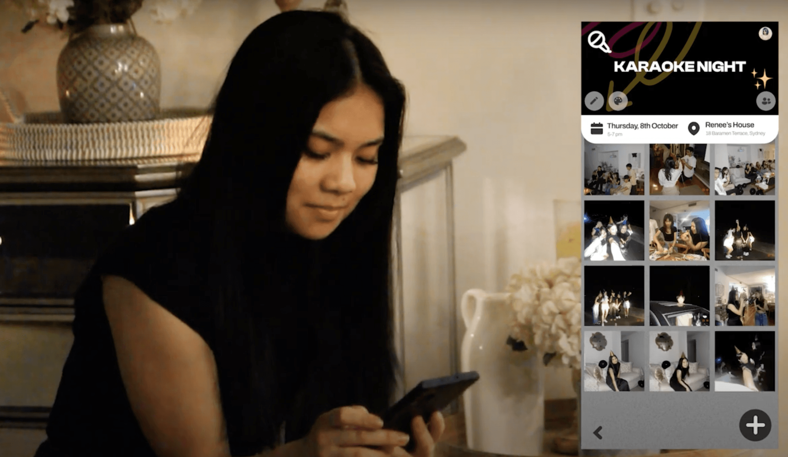
🎨 Brand and Visual Identity
Visual Motifs
Inspired by film photography and zine culture, our visual language aimed to capture a sense of nostalgia and emotional warmth. We blended analog charm with modern UI to create a product that feels both familiar and fresh, reminiscent of a bygone era, but tailored for Gen Z.

Photo selection grid for creating party recaps.
Film Photography
We focused on captivating Gen Z audiences, striving to achieve the highly sought-after vintage film aesthetic, which is immensely popular.

Event summary screens for Memento Wrapped.
Digital Zines
We wanted to convey the app as one that's fun and accessible, making users excited to start their new journey with Memento.
Design System
A shared design system helped us create a cohesive, scalable, and professional UI, ensuring every component felt consistent across screens.

Core style guide including type, colour, logo and buttons.
Committing to a design system helped me scale with intention. It reinforced the idea that structure supports clarity, collaboration, and emotional safety, not just consistency.
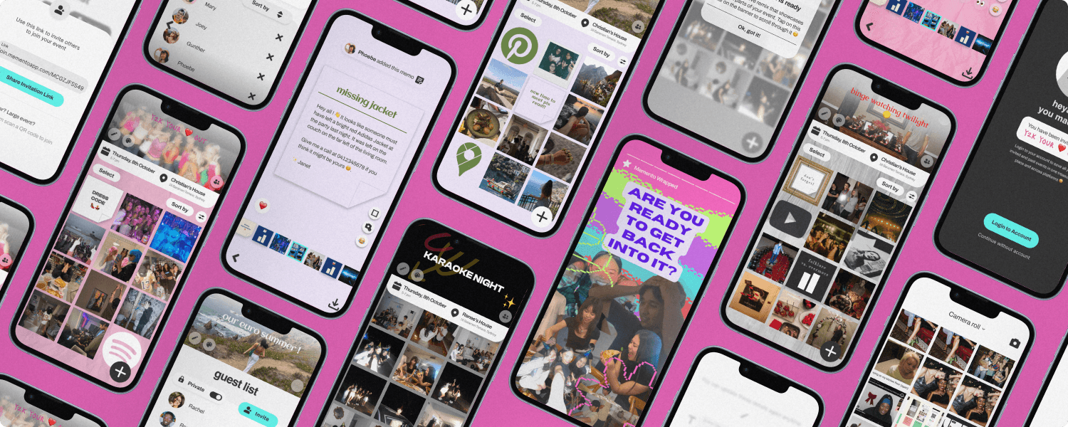
🧠 The Final Product

Mockup showing party albums and Memento Wrapped.
⭐️ Key Features


🎥 The Promo Video
📌 Lessons Learnt
After investing significant time into research, testing, and refinement, I walked away with a project I'm genuinely proud of. Along the way, I also picked up a few lessons worth sharing:
💎 The double diamond
Following the double diamond taught us that sometimes, you don’t need to follow frameworks too strictly.
As our process unfolded, we found ourselves layering tests, iterating designs, and revisiting old assumptions in ways the model didn’t always account for. Our takeaway? Be guided by structure, but not bound by it.
🔁 What's Next?
If Memento were to continue, here’s what I’d love to explore next:
📲
Secure IP protections for original features before broader testing or public release.
🏃♀️
Run longitudinal field tests to see how real users interact over time.
😂
Address RealMoji compatibility by either collaborating with BeReal or exploring ethical alternatives for live emotion capture.
🎥 That’s a wrap! Thanks for making it to the end (and for sitting through my brain dump).